
The tragically hip collection
How do you turn a band's final tour into objects worth keeping forever?
Role
Lead Designer
company
Frameworth Sports Marketing
year
2017-2019
the context
In 2016, Gord Downie announced he had terminal brain cancer. The Tragically Hip—arguably Canada's most beloved rock band—embarked on what everyone knew would be their final tour. The entire country watched. The final show in Kingston was broadcast nationally. Millions of people grieved together.
Frameworth had a licensing partnership with the band. Our job was to create commemorative collections that honored the tour, the band's legacy, and the cultural moment without feeling exploitative or commercial.
The Design challenge
This wasn't about selling merchandise. It was about creating objects that would help people hold onto something that was slipping away. Every design decision had emotional weight.
How do you balance nostalgia with celebration? How do you honor a dying frontman without being morbid? How do you create something fans would want to display in their homes for decades?
The approach
Visual language
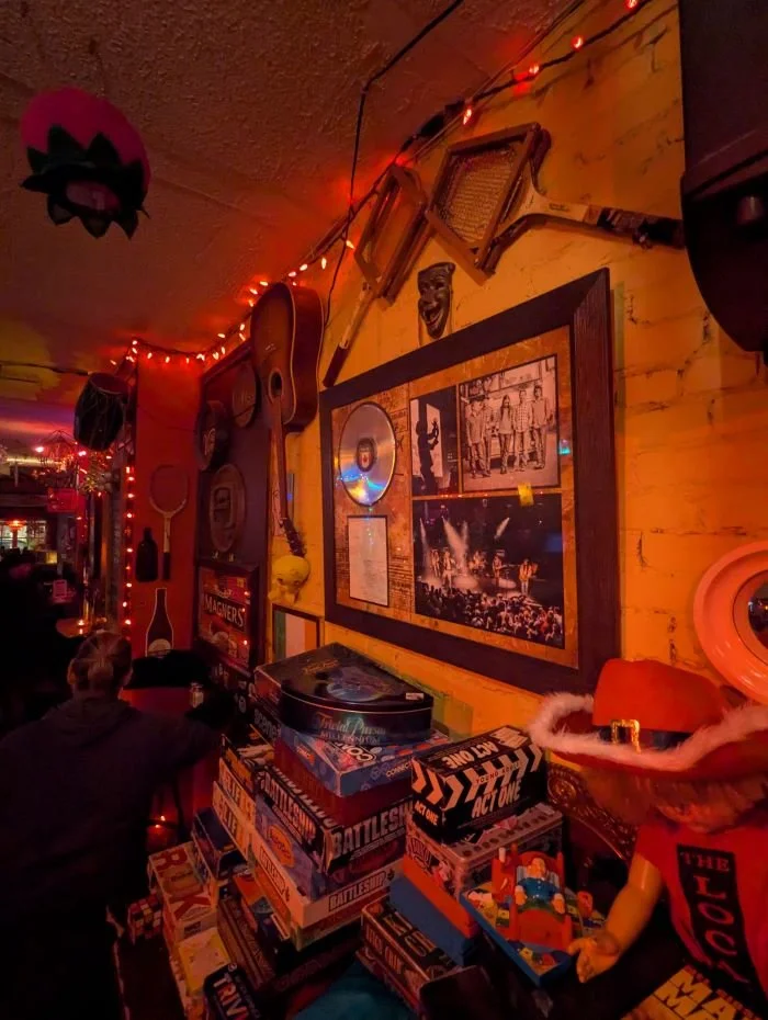
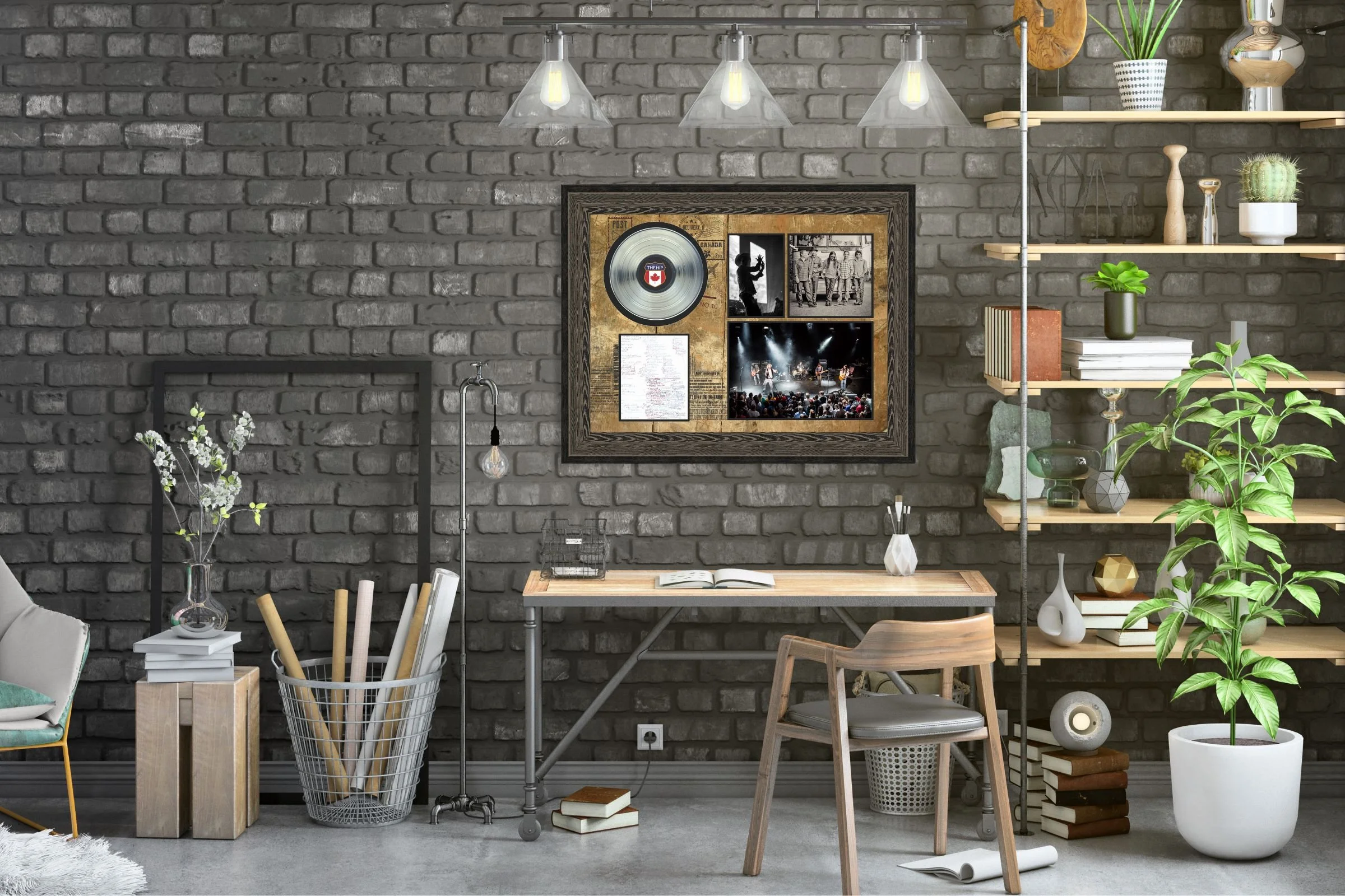
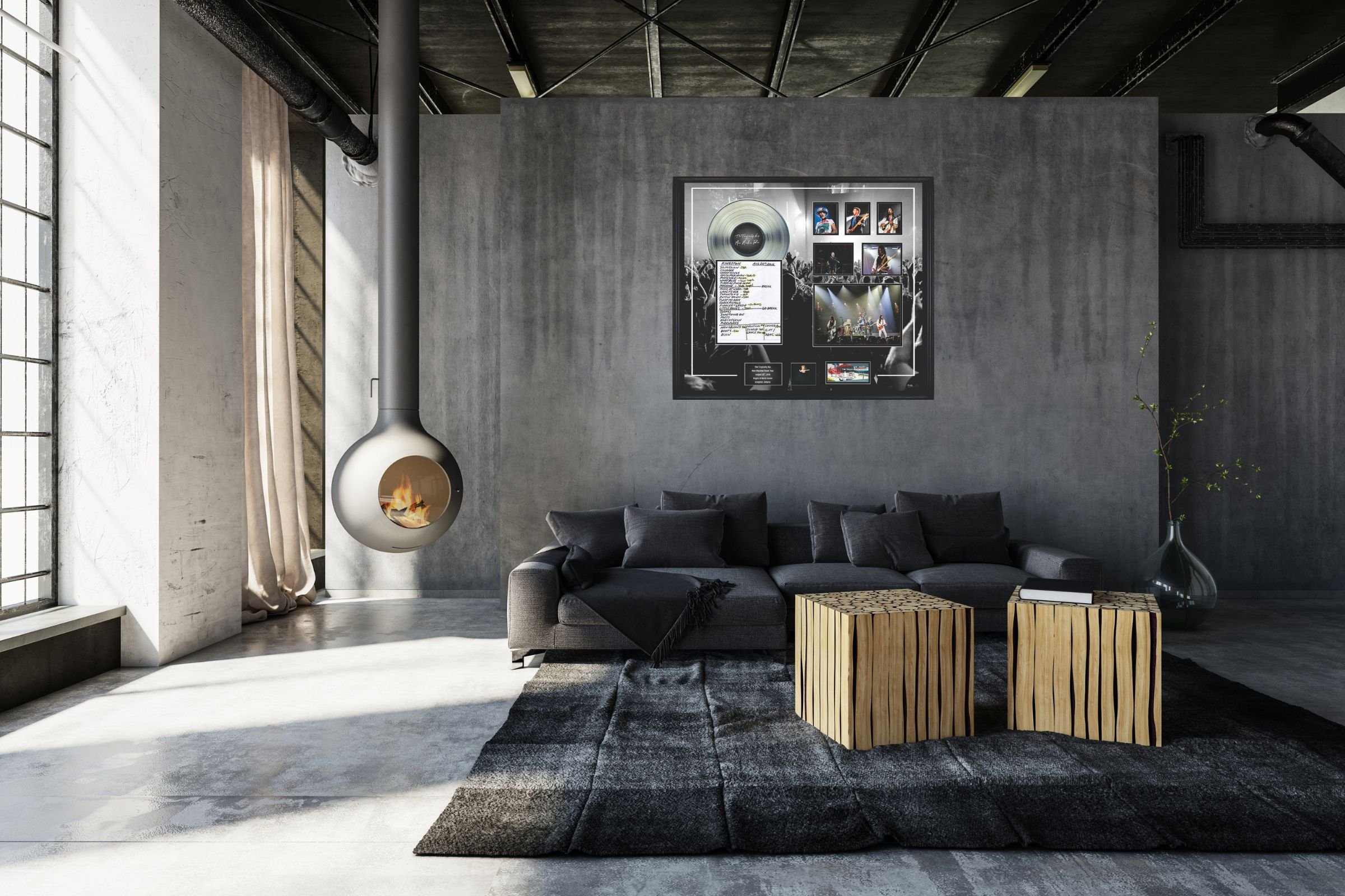
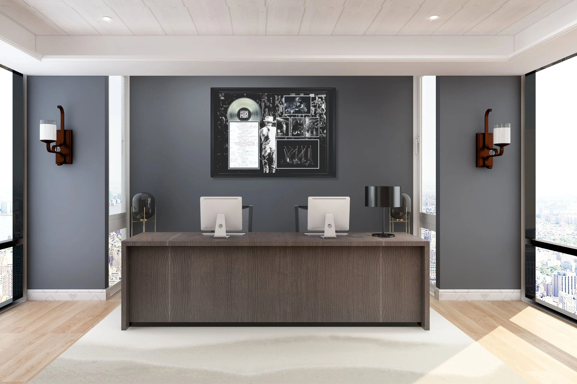
We created framed art pieces that combined tour photography, setlist reproductions, and iconic lyrics. The aesthetic was intentionally archival—black and white photography, museum-quality framing, typography that felt both classic and personal.
Each piece included authenticating details: actual ticket stubs, venue information, dates. This wasn't decorative art—it was documentation of a moment that mattered.
Manufacturing as Craft
My museum background became crucial here. I worked closely with production teams to ensure quality matched the emotional significance. These pieces needed to last as long as the memories they represented.
I needed to understand what this band meant to people—not as a brand, but as a presence in their lives. The Hip weren't just a band; they were part of Canadian identity.


What Made This different
The collection sold out. But more importantly, I saw photos of these pieces in people's homes—in living rooms, music rooms, home offices. They weren't stored away. They were displayed.
Years later, I still see them occasionally in the background of social media posts, on the walls of Toronto bars, in the homes of friends. They became part of how people remember that time.
-
Every design decision was filtered through the question: "Would someone who loved this band for 30 years want this in their home?"
-
No flashy design gimmicks. No attempts to make it "contemporary." We designed for permanence because that's what the moment required.
-
The color palette, typography, and composition all acknowledged that these pieces would live in a complicated emotional space—celebration and mourning at once.
This project taught me that the best design work happens when you understand what an object means to someone beyond its function. It's not enough to make something beautiful or well-crafted—you need to understand the role it will play in someone's life.
My anthropology background helped me see that we weren't just making commemorative art. We were creating artifacts that would help people process a collective cultural loss. That perspective—understanding objects as cultural carriers—shaped every decision.
This is the kind of work I want to do more of: projects where design serves memory, identity, and human connection. Where what you're making actually matters to someone.